

body+soul redesign
From a design perspective, it was imperative for body+soul to undergo a transformative journey to maintain competitiveness in the rapidly evolving online health sector.
The primary focus was on elevating user experiences and exploring a wealth of consistent and expansive commercial opportunities throughout the business.
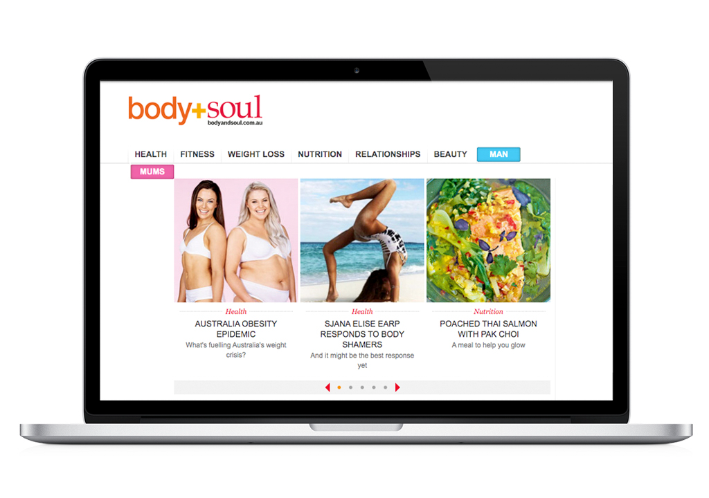
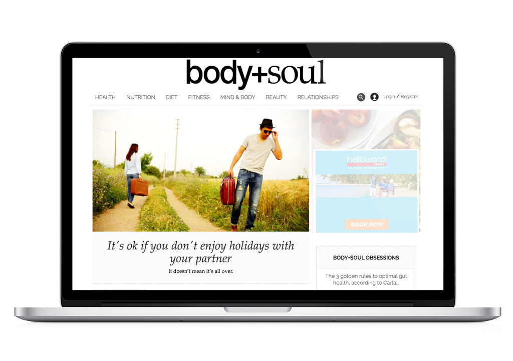
▴ previous site▴ new sitevisual style
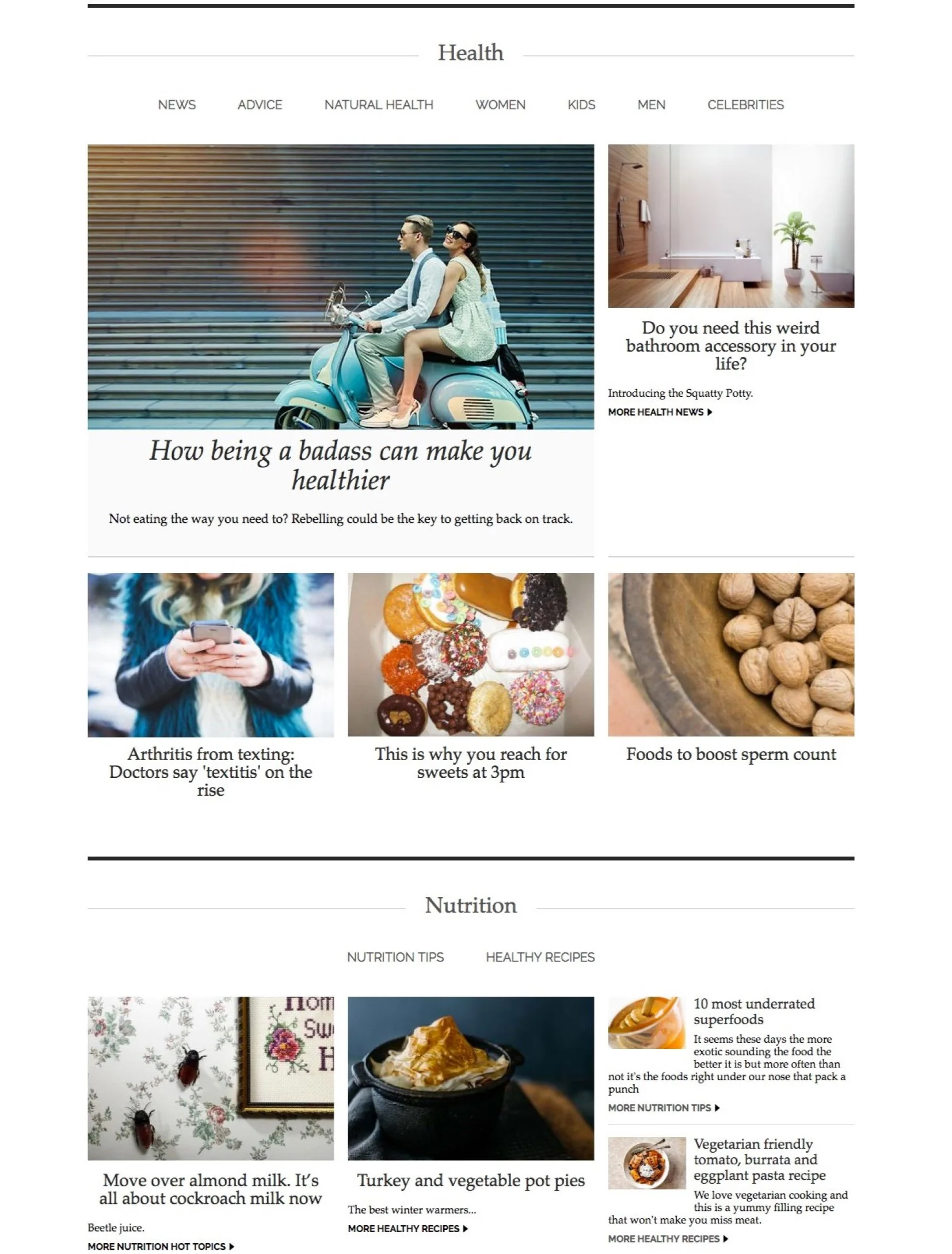
By establishing a platform that facilitated seamless content consumption and structured information in a clear hierarchy, we ensured a reader-friendly experience for our audience.
It bore resemblance to the ease of perusing a well-organized notebook or a neatly laid-out broadsheet.
From my perspective as the designer, I embarked on a focused journey to create a truly individualistic look and feel for our platform. I chose to strip away most of the design elements to achieve this unique aesthetic and employed the familiar fonts from our print materials to ensure cross-platform recognition.
Adhering to our existing template parameters was a priority, as it allowed me to distinctly differentiate the new website from its predecessor. This involved simplifying the placement of images and relocating headlines and stand-firsts beneath them.
I increased the amount of white space intentionally to provide more "air" between images and text. This not only enhanced the readability of the content but also made the images more prominent, resulting in a more compelling user experience.
To further accentuate the design, I introduced dividers with varying stroke weights. These dividers subtly marked section transitions, creating breakpoints that enhanced the vertical layout and maximized the overall readability of the content.
imagery
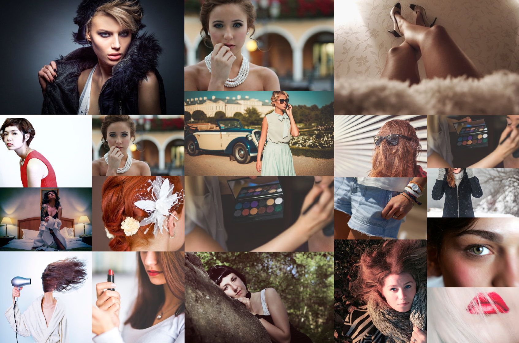
In my capacity as a designer, I've consistently acknowledged the potent impact of images when juxtaposed with text. Whereas text often necessitates a cognitive decoding process, images possess the exceptional capacity to engage our emotions directly, permeating our subconscious.
During the course of this project, I placed a distinct and paramount emphasis on the utilization of imagery. Particularly in domains such as food, where visual aesthetics hold paramount importance, I advocated for a profusion of large, prominent photographs to assume the central role in narrating the story.
The selection of imagery was meticulously curated to resonate consciously with the characteristics defining our target demographic—the Instagram generation. The deliberate choice of visuals, characterized by their raw, edgy, contemporary, and spontaneous nature, was aimed at forging a profound connection with our audience. This approach ensured that our design transcended mere communication and established a profound visual rapport with our readers.
typography

I opted to use fonts derived from the Body+Soul logo and print brand to resonate with the existing readership and to maintain a consistent brand identity across all platforms.
The primary font, Palatino was chosen to infuse a softer and more relaxed tone into the content, akin to the feel of a notebook or a casual blog. Its orderly structure incorporates ornate details, which aligns seamlessly with thisZ feminine-focused brand, conveying both style and elegance. Palatino's design strikes a balance between sophistication and boldness, making it an ideal choice for headlines.
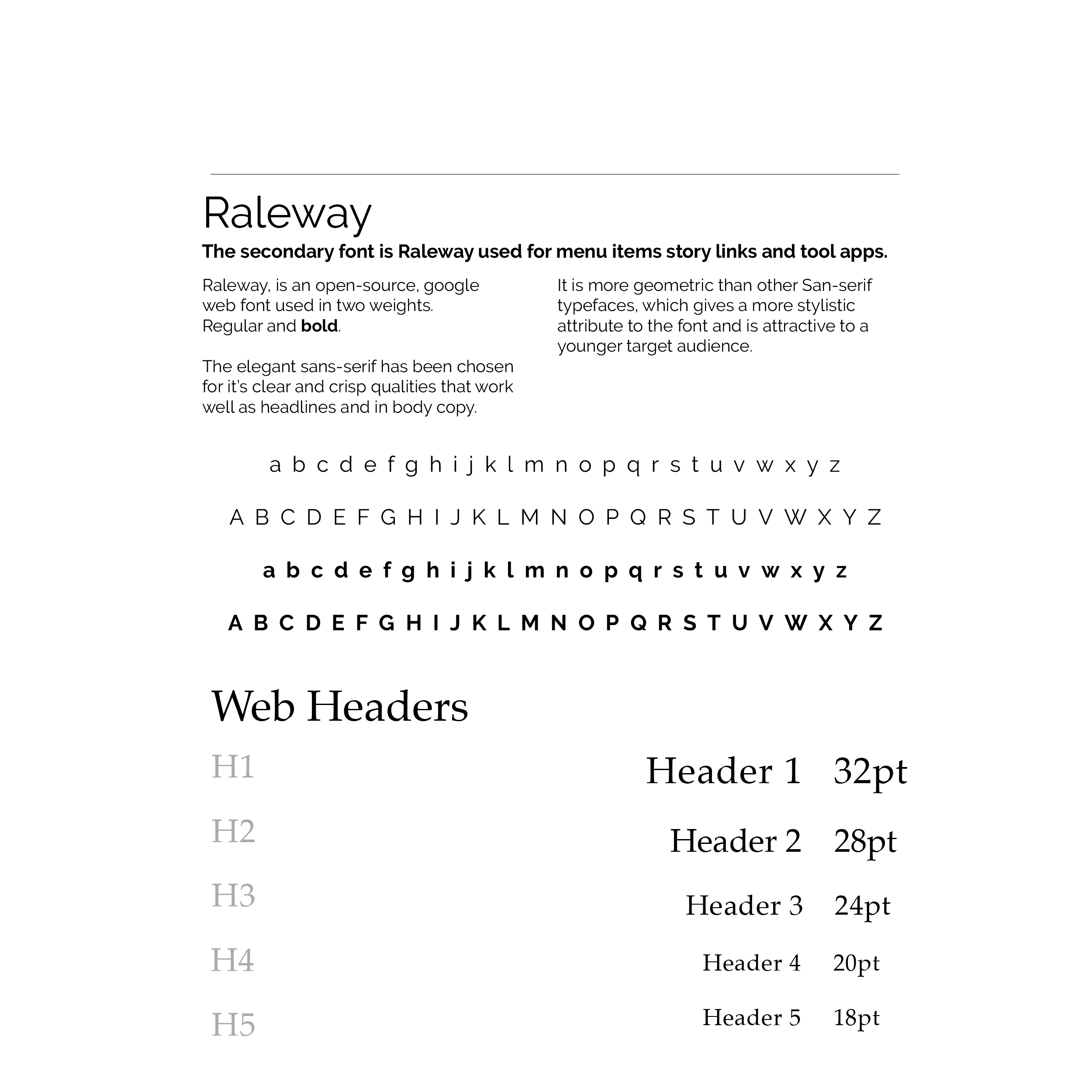
As for the body font and navigation menus, I turned to Raleway. This modern and elegant sans-serif font offers clarity and crispness that are well-suited for both headlines and body text. I utilized two weights of Raleway, an open-source Google web font, to enhance versatility in our design.
Raleway's geometric qualities add a distinctive stylistic element to the font, setting it apart from other sans-serif typefaces. This unique attribute appeals to a younger target audience, making it an attractive choice for our brand's aesthetic.
colour scheme
The editorial palette I've adopted is a classic combination of black and white, with various shades of grey. This minimalist approach allows the content to take center stage without distractions.
The rationale behind this choice is that by eliminating distractions, we can better direct the viewer's attention toward other key design elements, such as form and texture, which become more prominent in thedesign.
Now, when introducing color into the mix, it's done thoughtfully and sparingly, with a focus on monetization, as exemplified by the provided example. Color usage may also be strategically employed to promote events that cater to a female-oriented audience, like 'Breast Cancer Awareness Week.'
While color certainly has the potential to enhance a brand's value, it doesn't define our brand outright. Instead, it serves as a valuable tool to accentuate specific areas of the site, such as the iconic '+' in body+soul's logo, adding a touch of vibrancy when needed.
